
Crafting Compelling Experiences that Engage Audiences, Drive Action, and Bring Brand Stories to Life.
FEATURED WORK
_
FEATURED WORK _






Starbucks
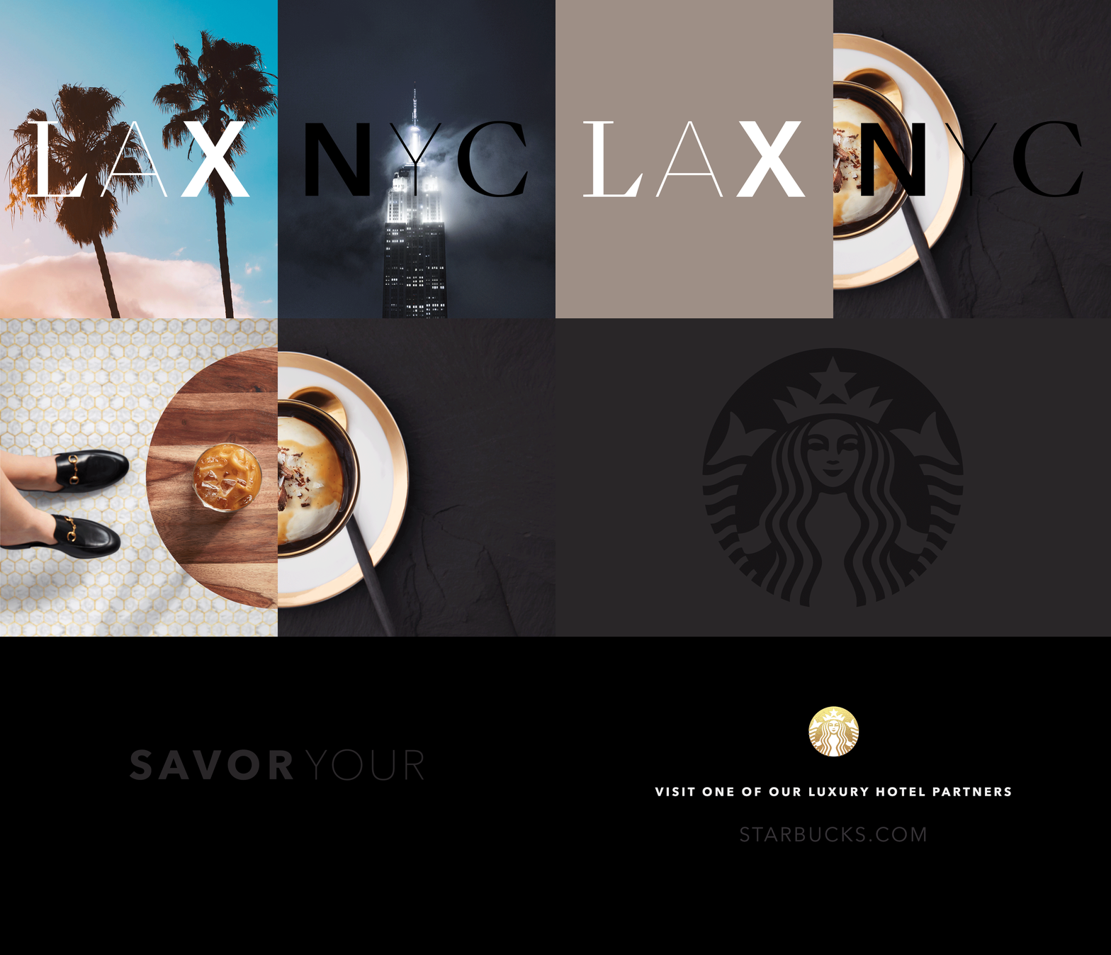
While Starbucks is considered a preferred vendor for large, mainstream hotels, they find it difficult to gain market share in the luxury space. Luxury hotel patrons expect more from high-end hospitality. They need the comfort and consistency that Starbucks is known for, but with curated menus and exceptional services that only a five star hotel can provide.
Background
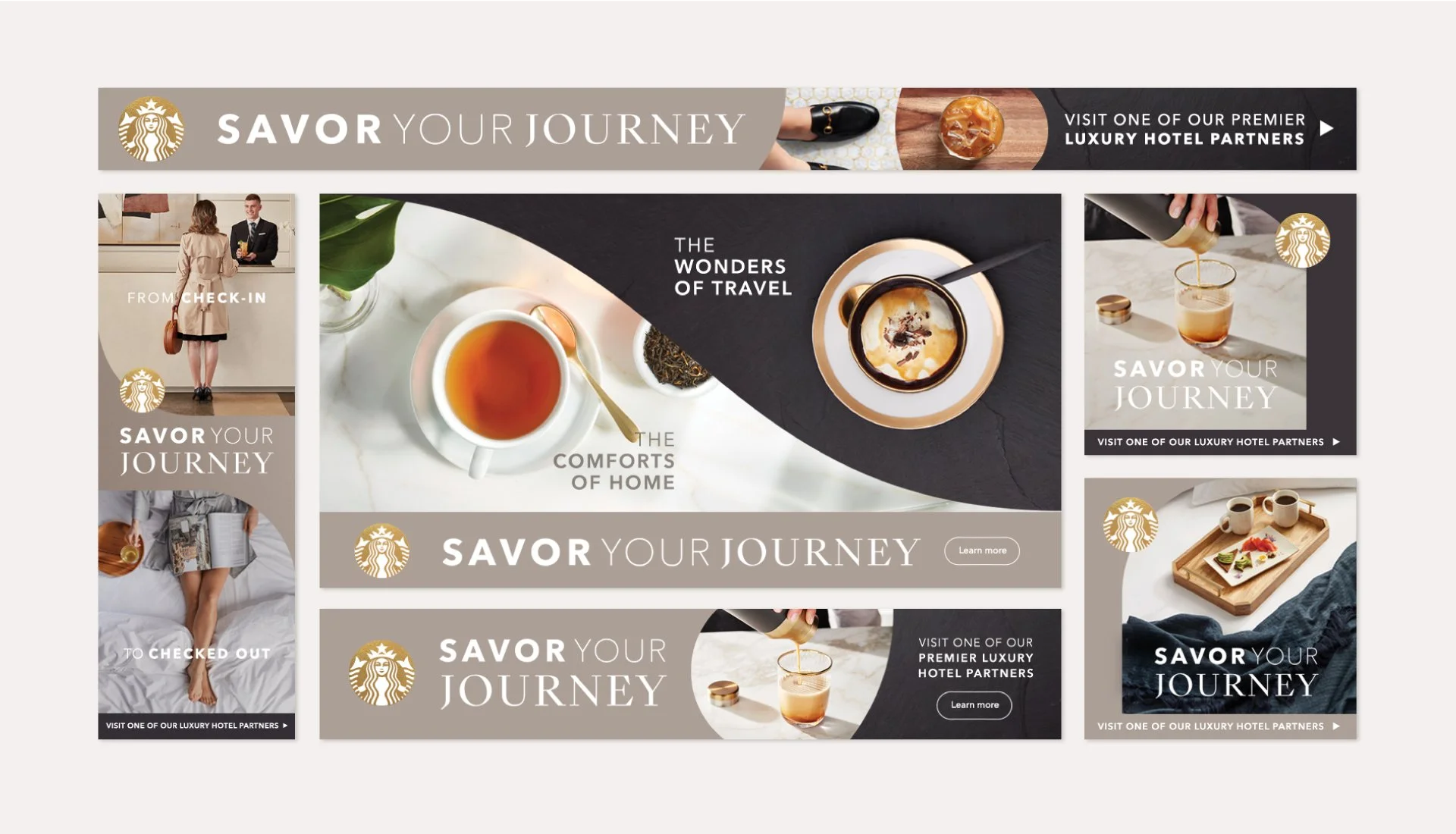
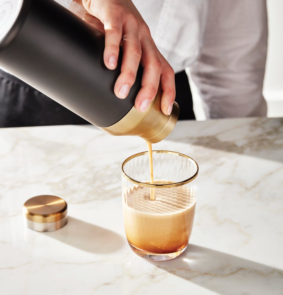
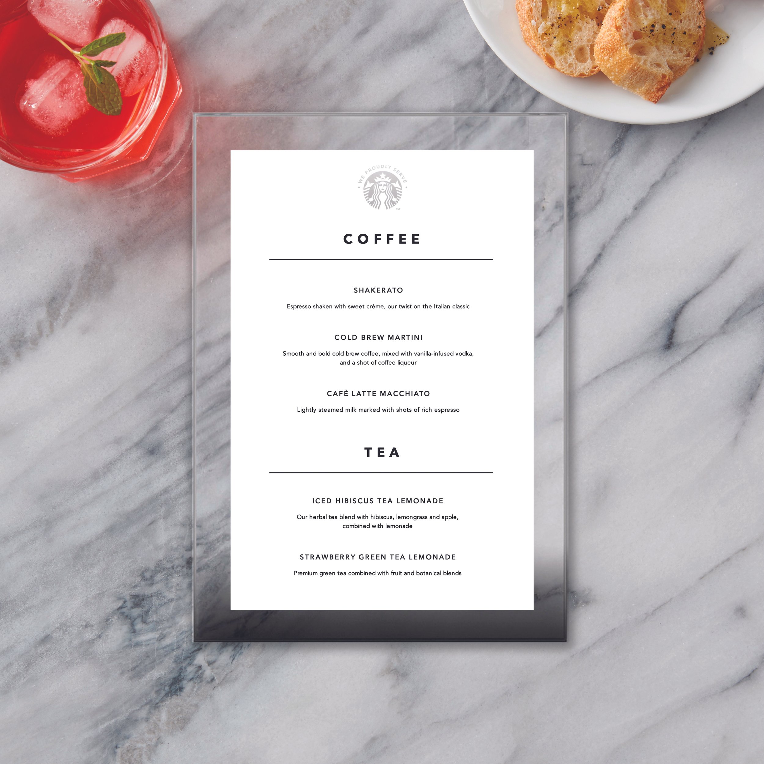
The project began with a deep-dive hotel audit to identify competitors, audience personas, current obstacles, and untapped opportunities. Insights revealed the unique needs of luxury patrons and highlighted touchpoints where curated offerings could elevate their experience and distinguish a Starbucks Luxury Hotel Partner from comparable accommodations. Building on these findings, the Starbucks tone of voice was elevated while staying true to its brand essence, paired with a refined look and feel expressed through stunning photography, elegant typography and color palette, and custom-designed visual merchandise. The result is a heightened brand experience that delivers the comfort of Starbucks with the sophistication expected in luxury hospitality.
Approach
Directed brand strategy and positioning to align Starbucks with the expectations of luxury hotel patrons.
Designed collateral and visual merchandising that translated strategy into a tangible, elevated guest experience.
Led product sourcing and design to create custom menu elements and branded touchpoints unique to luxury environments.
Art-directed photography to capture the refinement and intimacy of the luxury hotel setting.
Personal Impact



House Studio
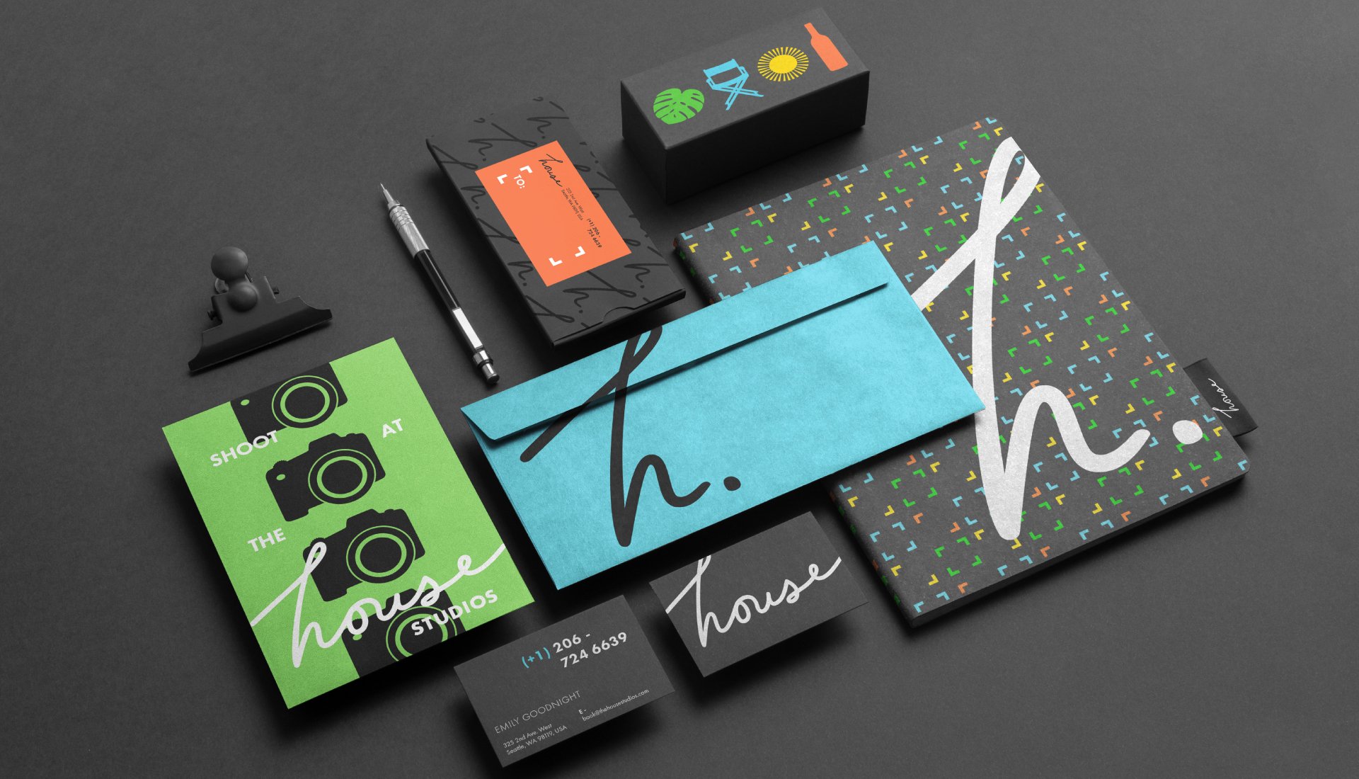
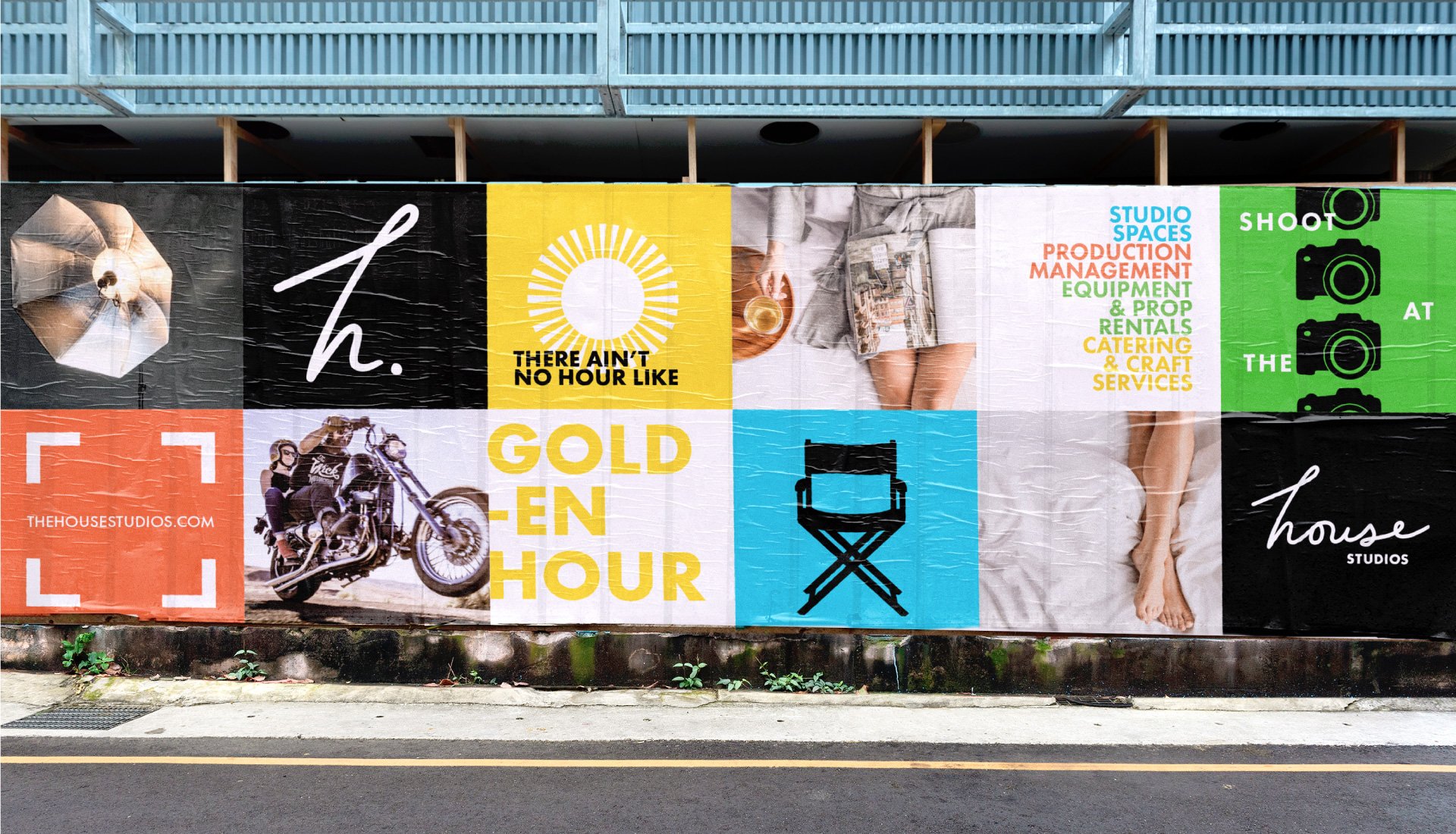
House is a full-service photography and video production company in Seattle, WA. Founded 10 years ago, the business has grown into a multifaceted production studio. With ambitious goals ahead, Founder Emily Goodnight asked us to help redefine and level up the House brand to better represent their creativity, customer service and expertise.
Background
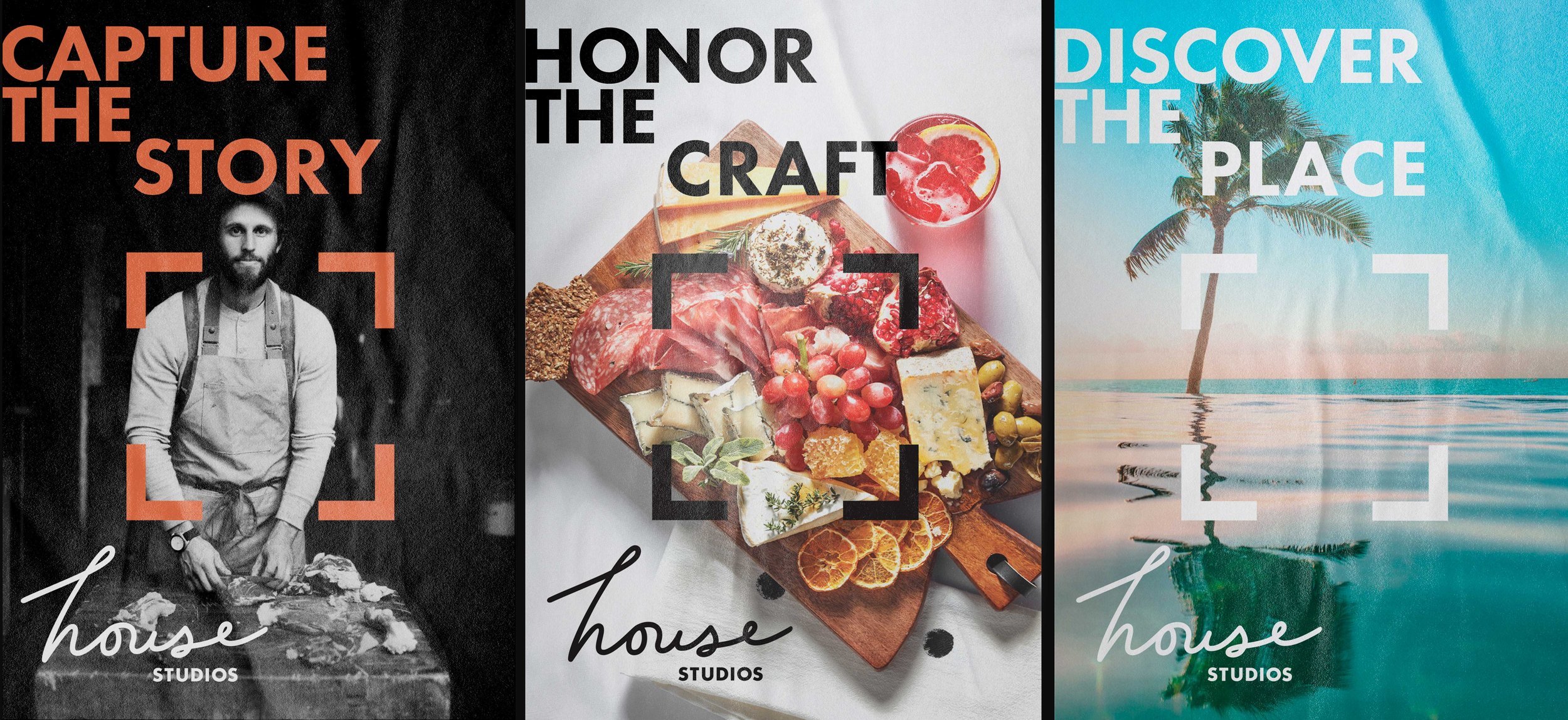
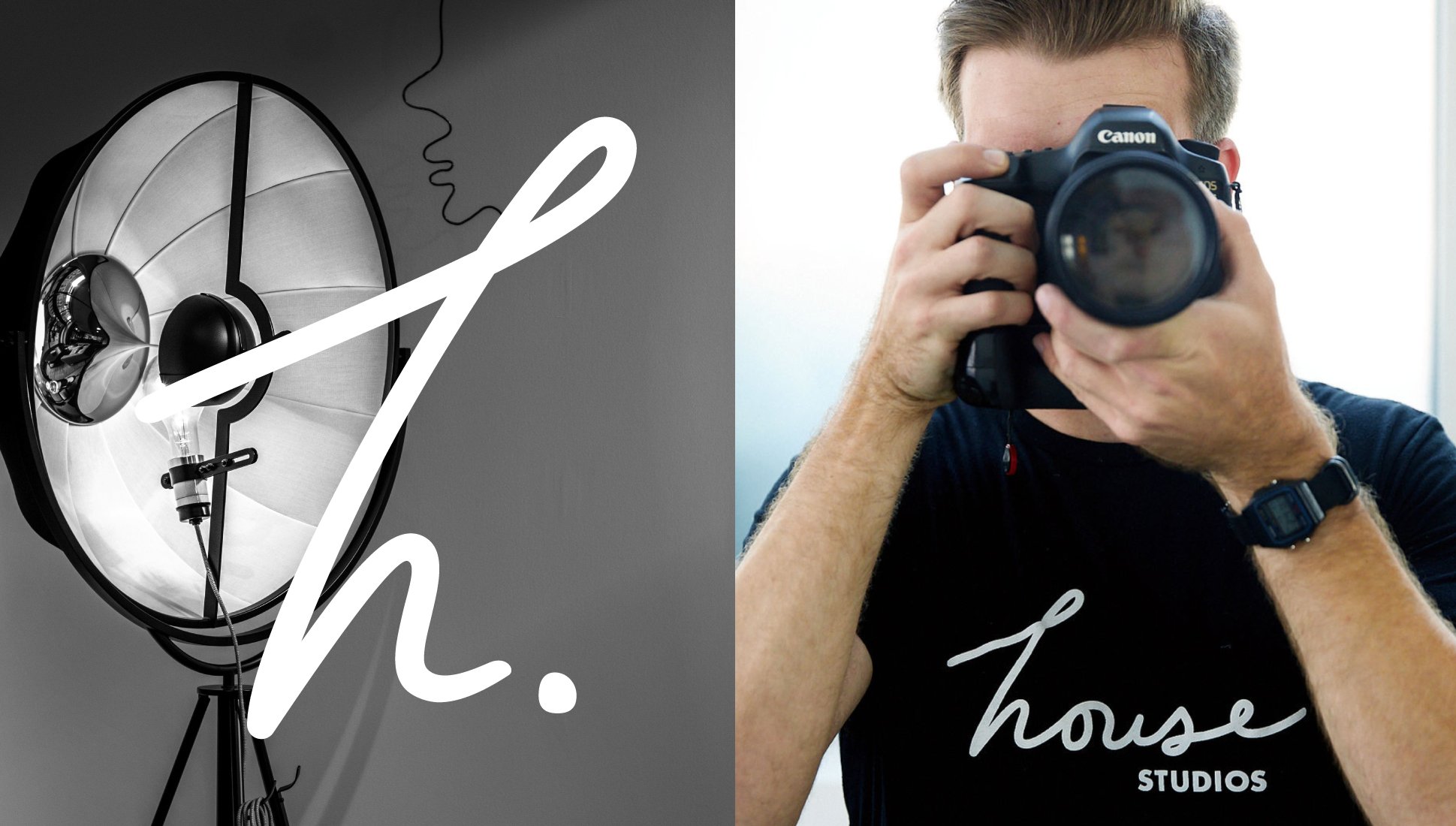
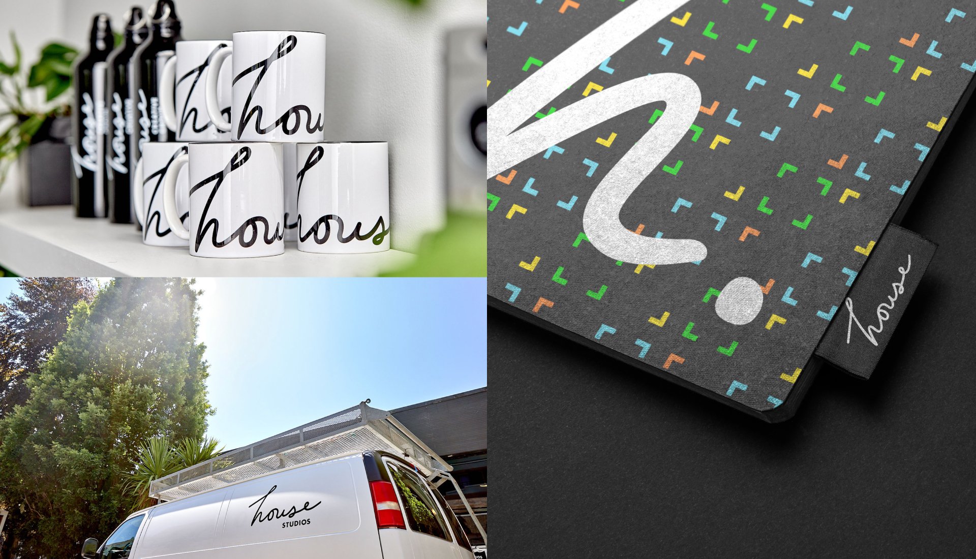
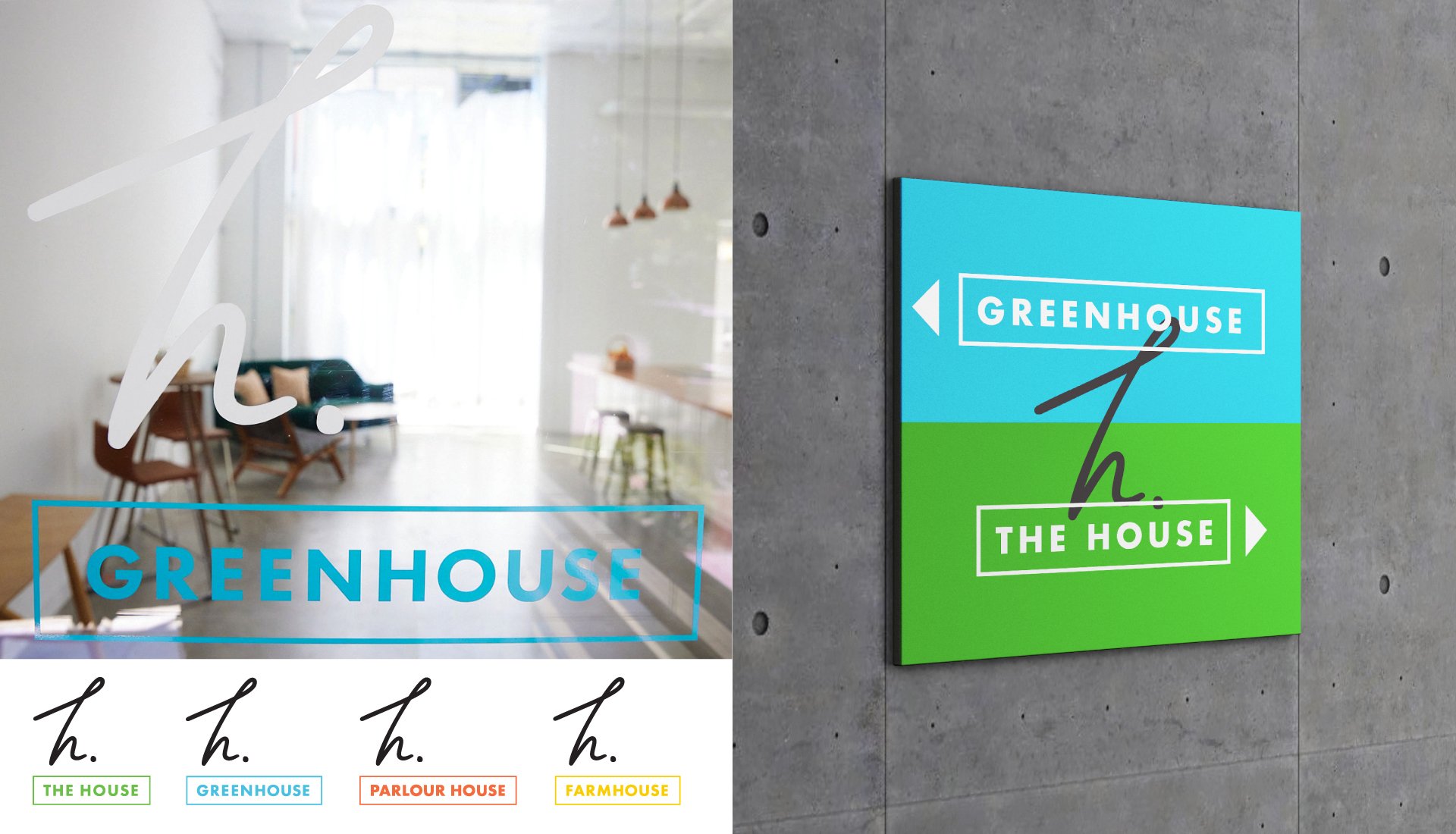
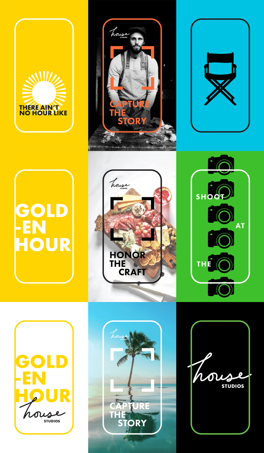
We kicked off the project with an in-depth Brand Discovery that uncovered a culture rooted in hospitality and an environment where creativity thrives. These insights shaped a robust identity system featuring a hand-scripted wordmark, vibrant color palette, custom illustrations and patterns, bold typography, and a casually confident tone of voice. Paired with House-made photography and videos, the system provided the essential tools to create dynamic, custom, and layered brand experiences that reflect the casual, collaborative, and personal nature of shooting at House.
Approach
Led the Brand Discovery process through a brand workshop ato uncover insights and guide creative direction.
Shaped the overall brand strategy and defined the positioning to capture House’s culture of hospitality and collaboration.
Designed the visual identity system, including logos, typography, color palette, illustration, and pattern design.
Personal Impact



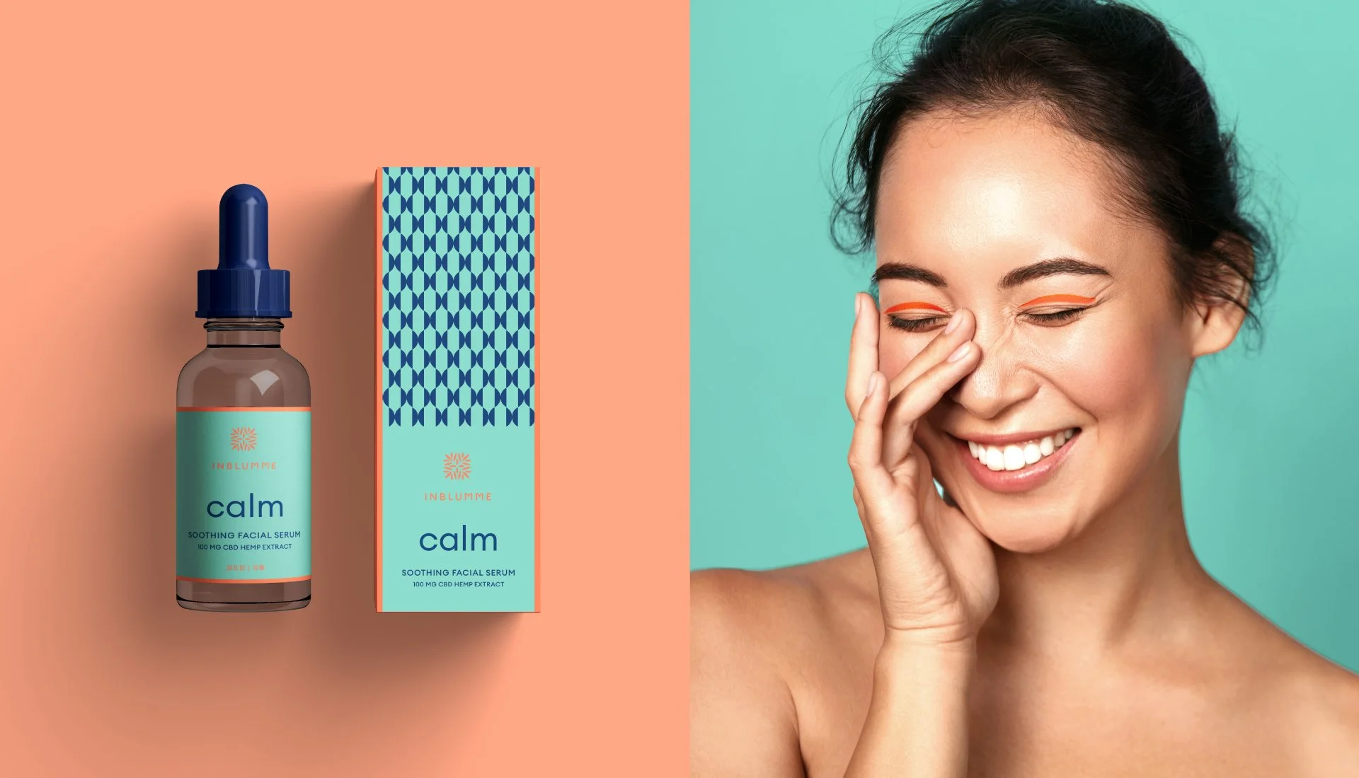


InBlumme
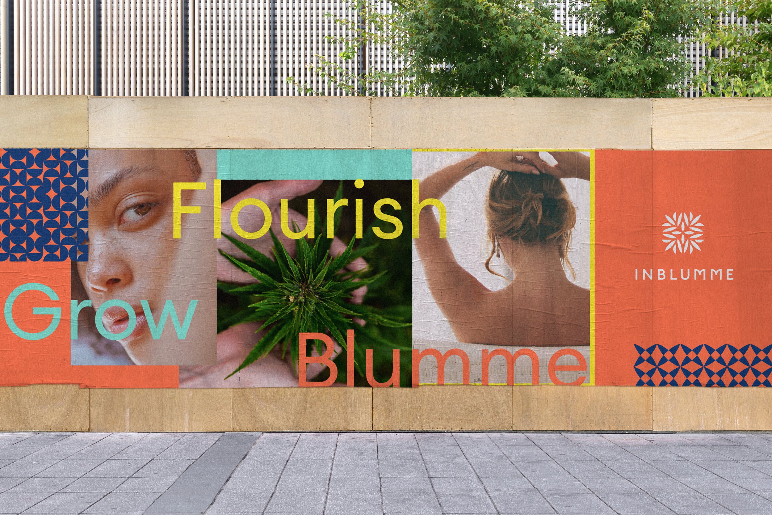
InBlumme came to us with a bold idea: to own the conversation around the benefits of hemp in skincare and set a new standard for CBD infused beauty products. Skincare is a saturated market, so discovering and targeting white space was crucial for success. InBlumme’s differentiator was clear– a steadfast commitment to transparency around their products’ what, how and where.
Background
With endless competitor promises of better, younger skin, the brand was positioned to deliver a simpler, more honest narrative that highlights the time-tested benefits of hemp for skin, community, and the planet. This direction informed the creation of a vibrant identity system that blooms with optimism and connectivity. Bold-colored, Scandinavian-inspired design elements, paired with an aspirational yet approachable tone of voice, created a strong multi-channel presence that reflects the energy of the brand. The result is a confident identity that cultivates trust in both women and the products they put on their skin.
Approach
Personal Impact
Directed brand strategy and positioning to identify white space and establish a distinctive market presence.
Shaped the brand narrative to emphasize authenticity, transparency, and the benefits of hemp in skincare.
Design the visual identity system, including logo, color palette, typography, and packaging design.
Crafted copywriting and messaging to balance aspiration with honesty.



Fire & Vine
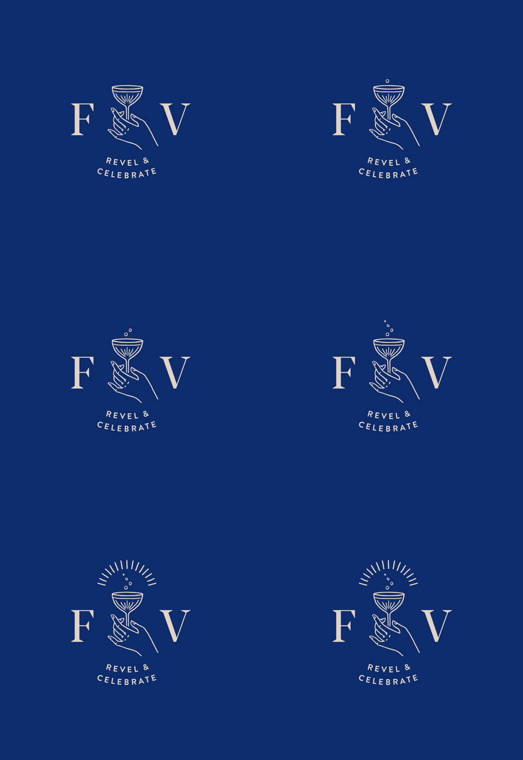
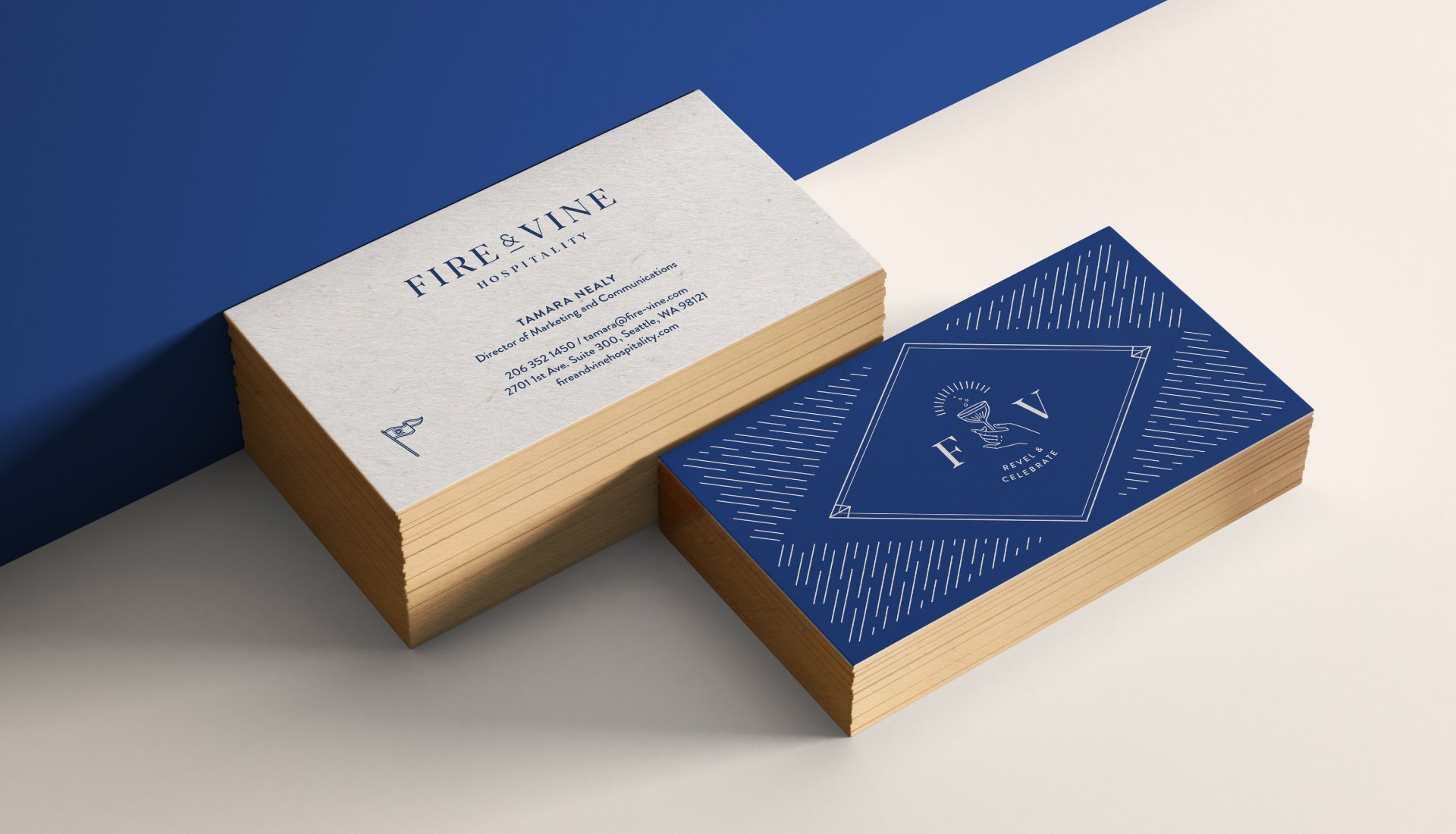
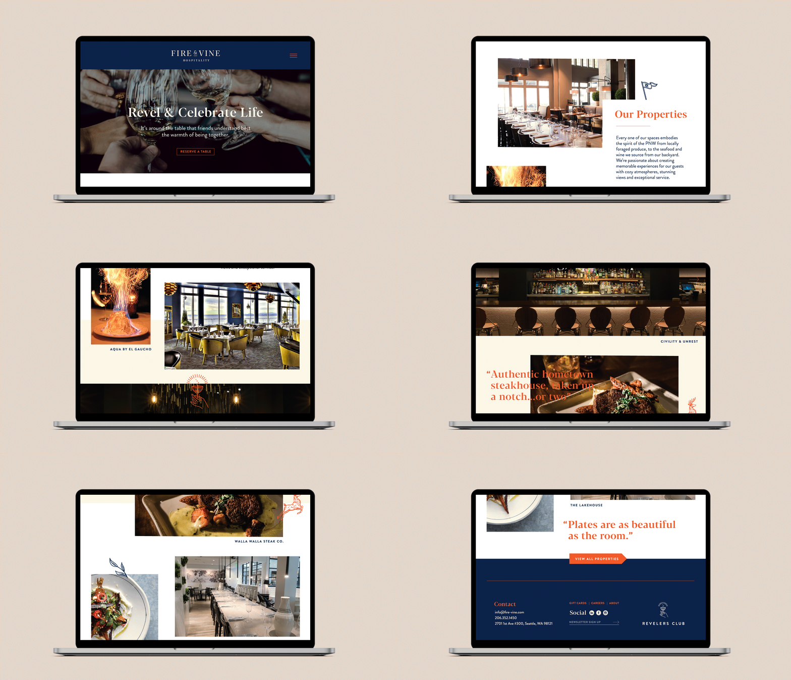
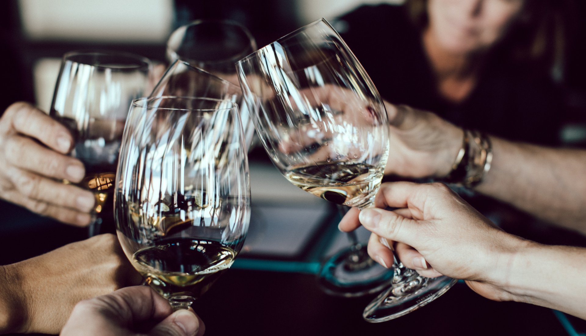
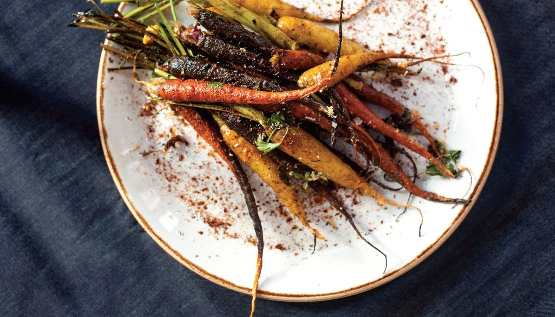
Fire & Vine Hospitality is responsible for some of Seattle’s most iconic restaurants. After decades of growth, the company needed a brand refresh that streamlined its connection to their portfolio of properties and integrated loyalty program. Taking inspiration from their brand’s “Why” which is to “Revel & Celebrate Life” we developed a brand identity with a sense of camaraderie and sophistication. It’s a celebration of their trailblazing contribution to the PNW hospitality industry that has been bringing friends and family together for over 30 years.
Background
Directed brand strategy and positioning to identify white space and establish a distinctive market presence.
Shaped the brand narrative to emphasize authenticity, transparency, and the benefits of hemp in skincare.
Design the visual identity system, including logo, color palette, typography, and packaging design.
Crafted copywriting and messaging to balance aspiration with honesty.
Personal Impact








The Oak Room
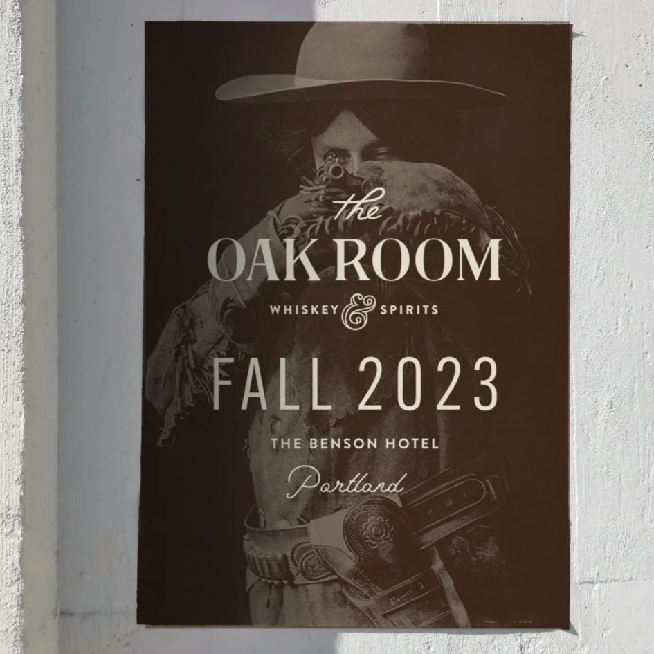
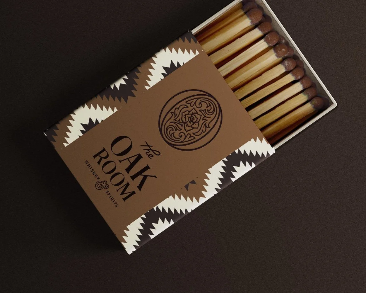
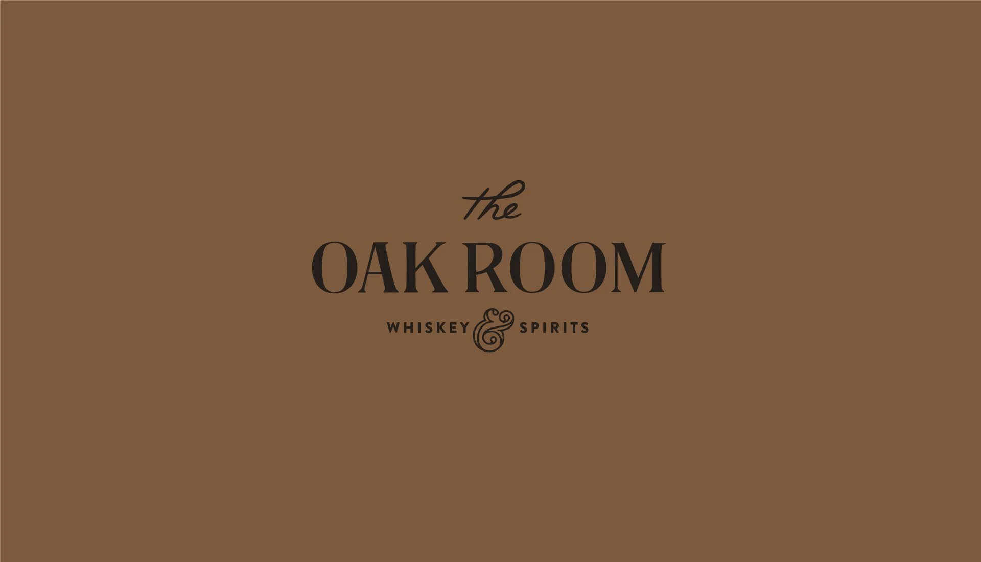
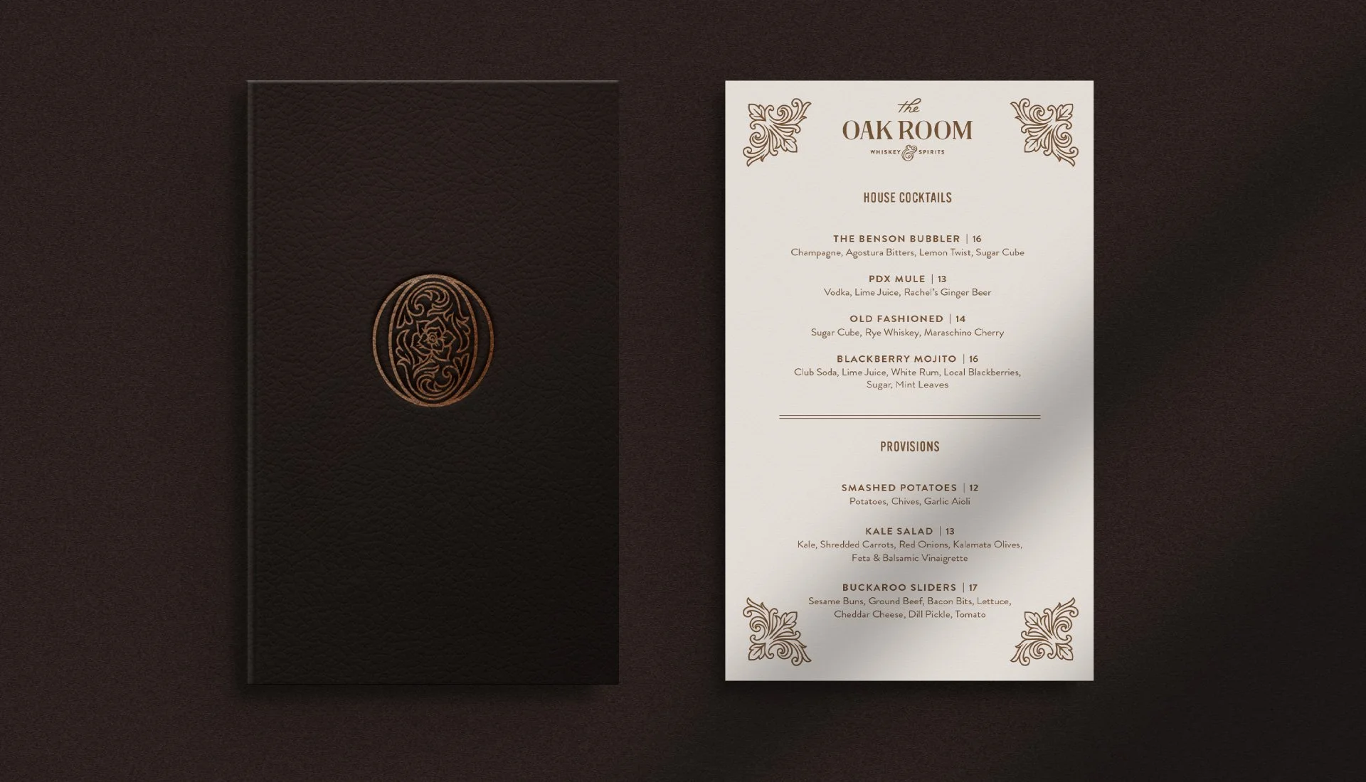
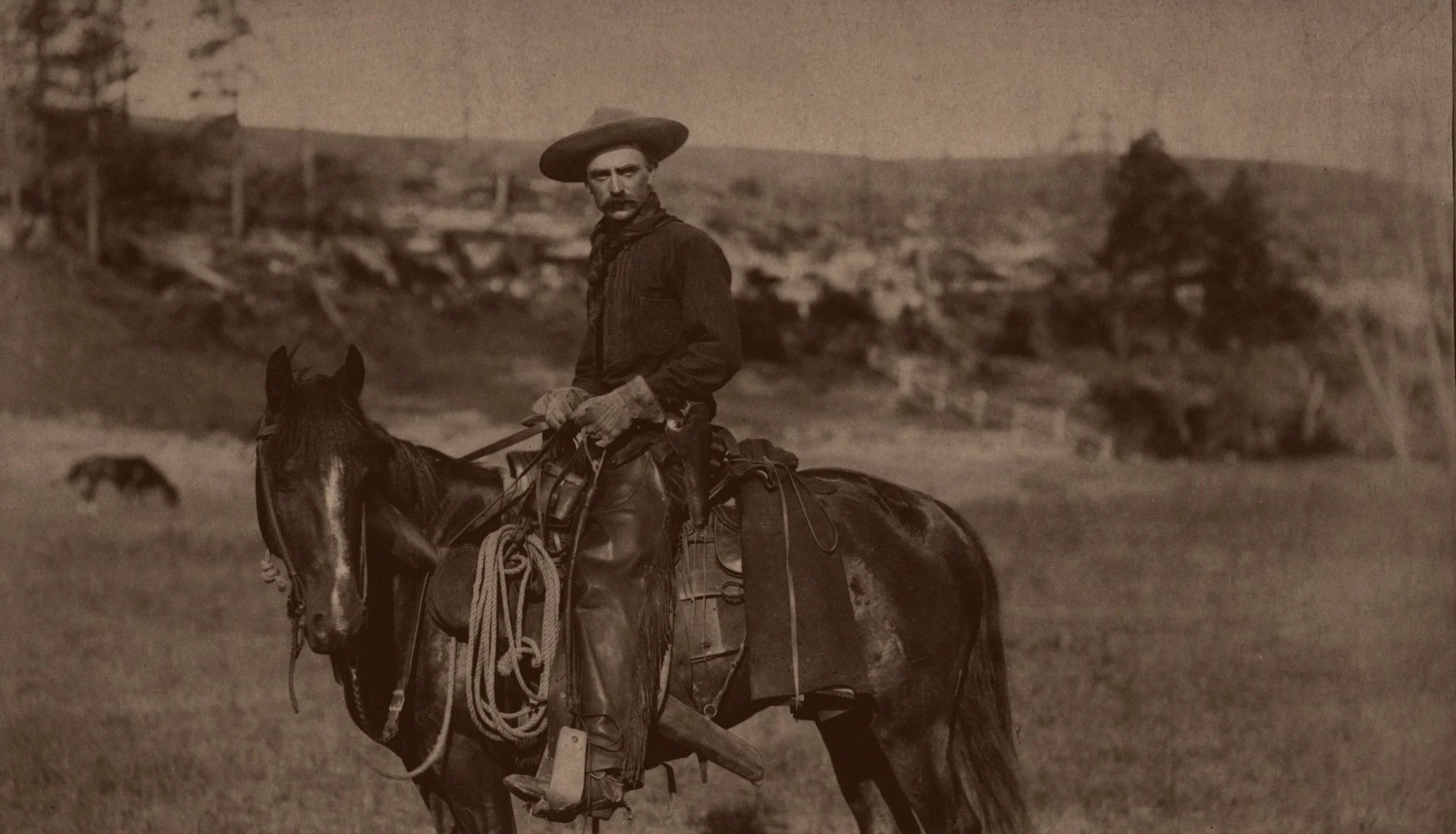
Soon to be located in the historic Benson Hotel in Downtown Portland, The Oak Room’s speakeasy vibe is a homage to the spirit of the Oregon Buckaroos that drove cattle across the Western United States. The centerpiece Logo Mark is an oval-shaped, Portland rose icon crafted to echo the decorative leather designs of western wear. Each custom-designed brand element is inspired by flourish-tooled saddles and native patterned blankets–giving the brand a layered and refined, yet warm and rugged feel.
Background
Conducted brand discovery to uncover the historical and cultural inspiration for the identity.
Developed the brand identity system, including logo design, typography, and illustrative elements that convey a layered, rugged elegance.
Designed print collateral that reflects the brand’s speakeasy and Western heritage.
Created brand guidelines to ensure consistency across all applications.
Directed campaigns and promotional materials to communicate the brand story and build anticipation for launch.