
Sitemap & Wireframe Development
Copywriting
Animation Direction
Website Design
Developer Collaboration
Deliverables
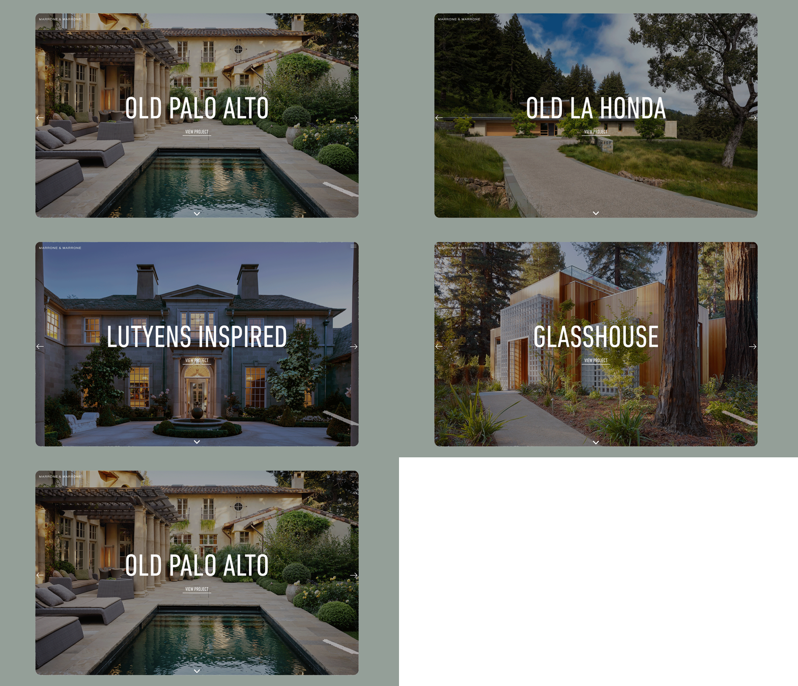
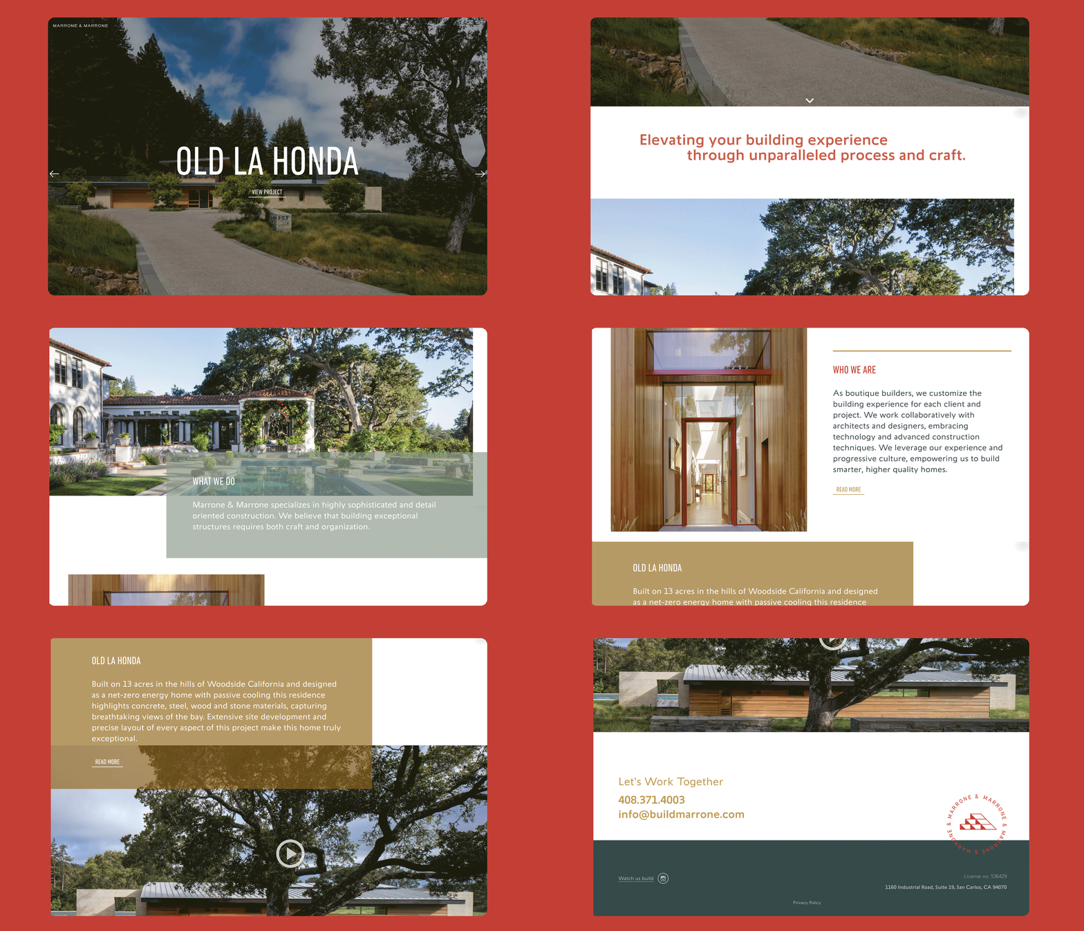
Marrone & Marrone is a family owned and operated builder specializing in highly detailed, luxury homes in the Bay Area. After completing a full rebrand, they asked for our help in a website re-design that reflects their new look and feel. Using fresh brand elements of bold color and typography, beautiful photography and sleek animation, we created a user experience that successfully represents their personalized service and modern approach in crafting stunning, custom homes.
Project Overview
Content Strategy
Sitemap & Wireframe Development
Photo Art Direction
Animation Design
Website Design
Developer Collaboration
Deliverables
Project Overview
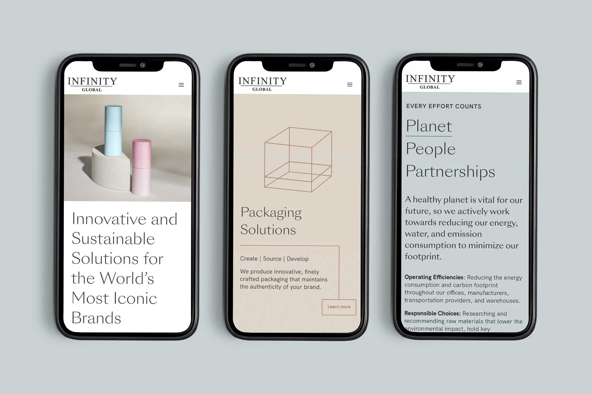
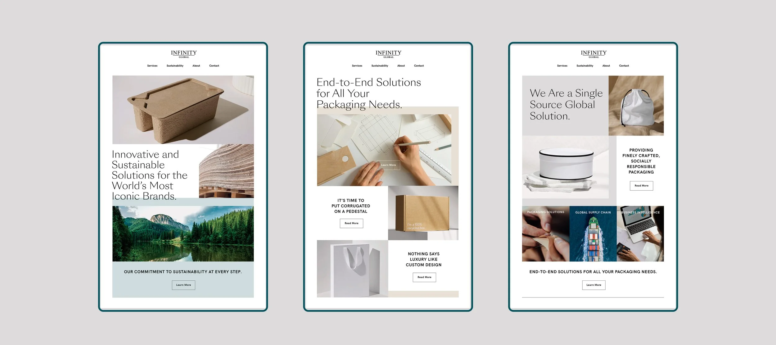
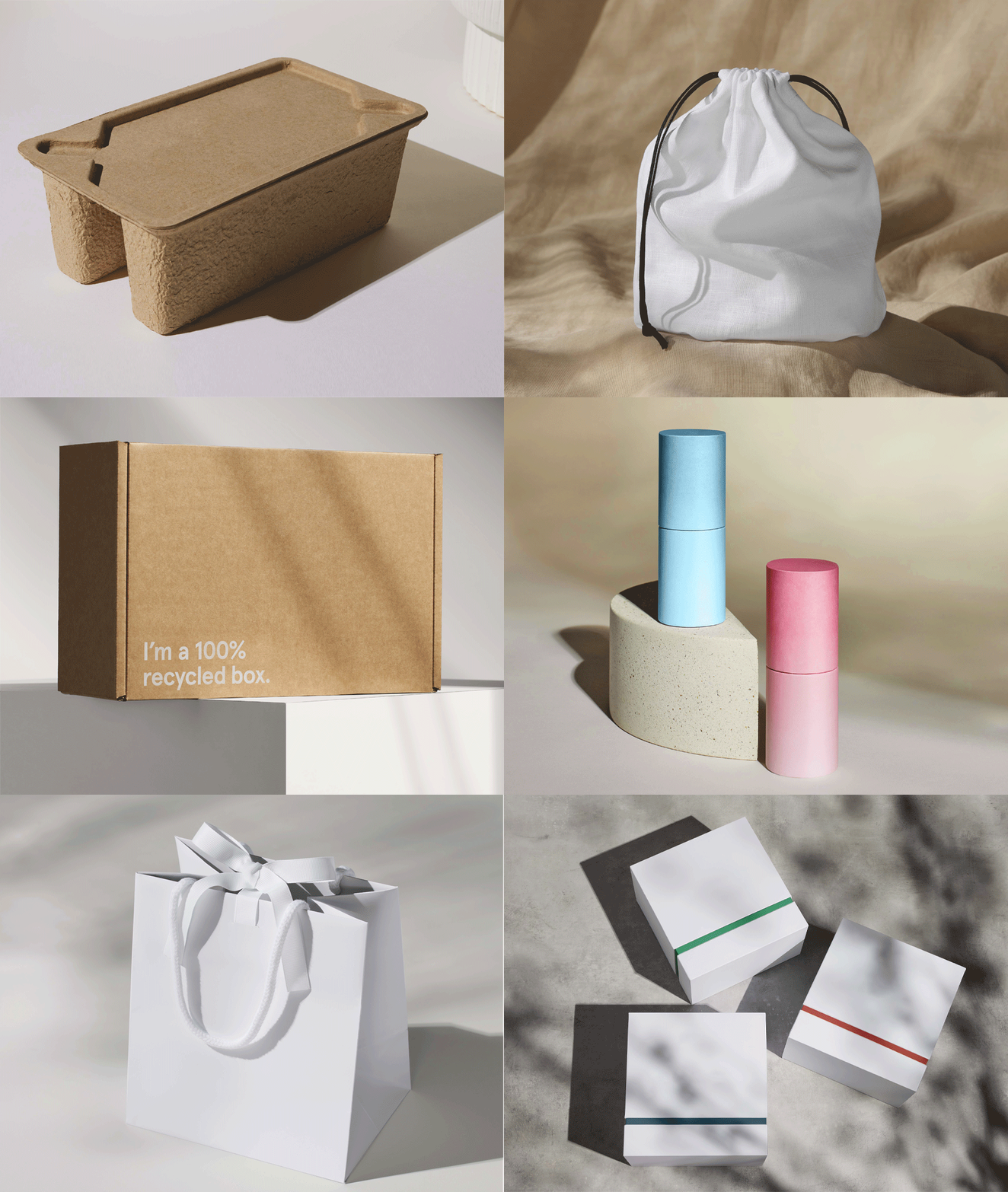
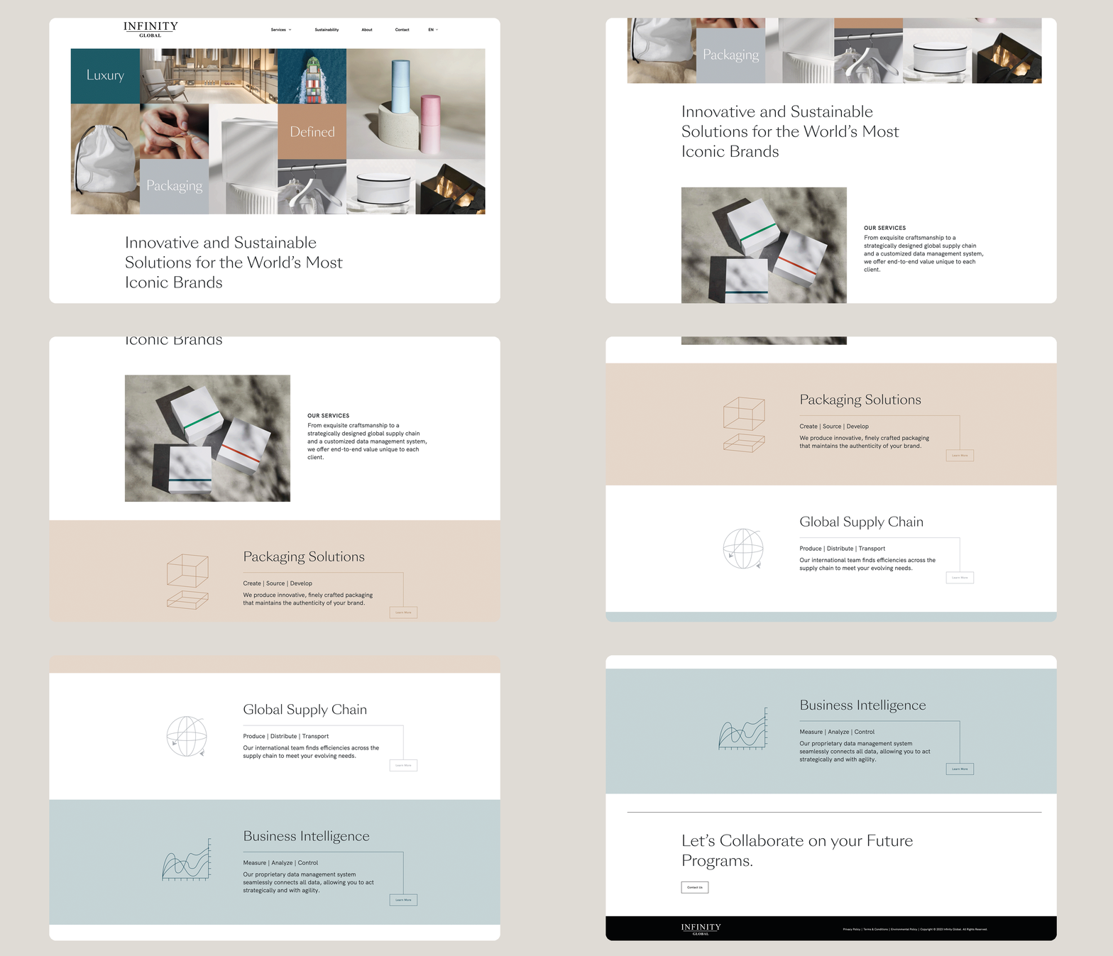
Infinity Global is single source solution packaging company that offers it all. With decades-long relationships serving well-known luxury brands, it was important that their digital presence aligned with the same level of sophistication. Our biggest challenge was to generate beautiful images of packaging without the luxury brand names. We achieved this with simple, yet elegant props, lighting and angles to make these humble products appear elevated and aspirational. These dynamic images combined with a well formulated content strategy, timeless typography and seamless animation produced a refined user experience with a luxury goods feel.


Brigado
Brand Discovery
Naming
Brand Identity
Brand Guidelines
Website Design
Print Design
Campaign Development
Deliverables
Project Overview
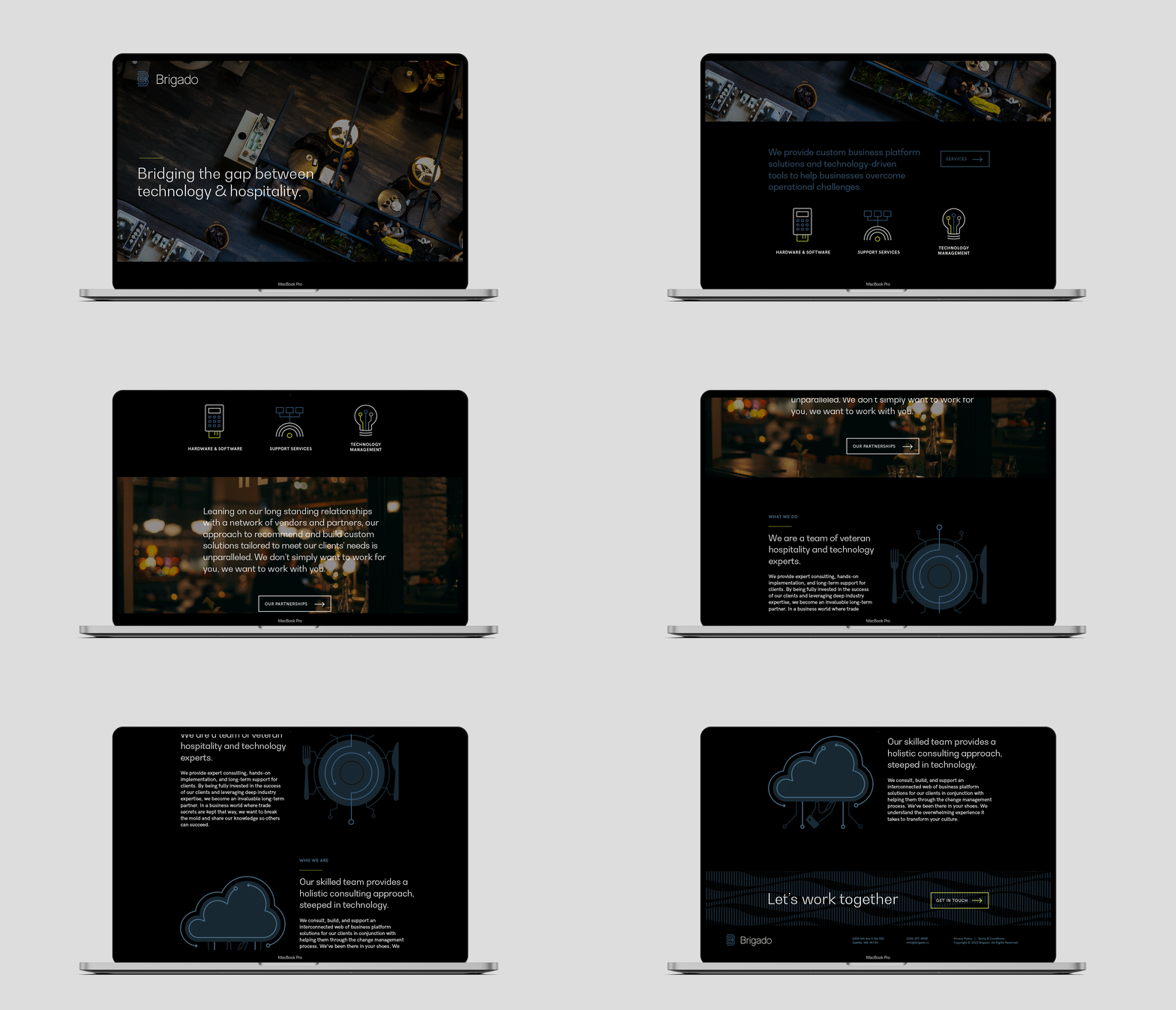
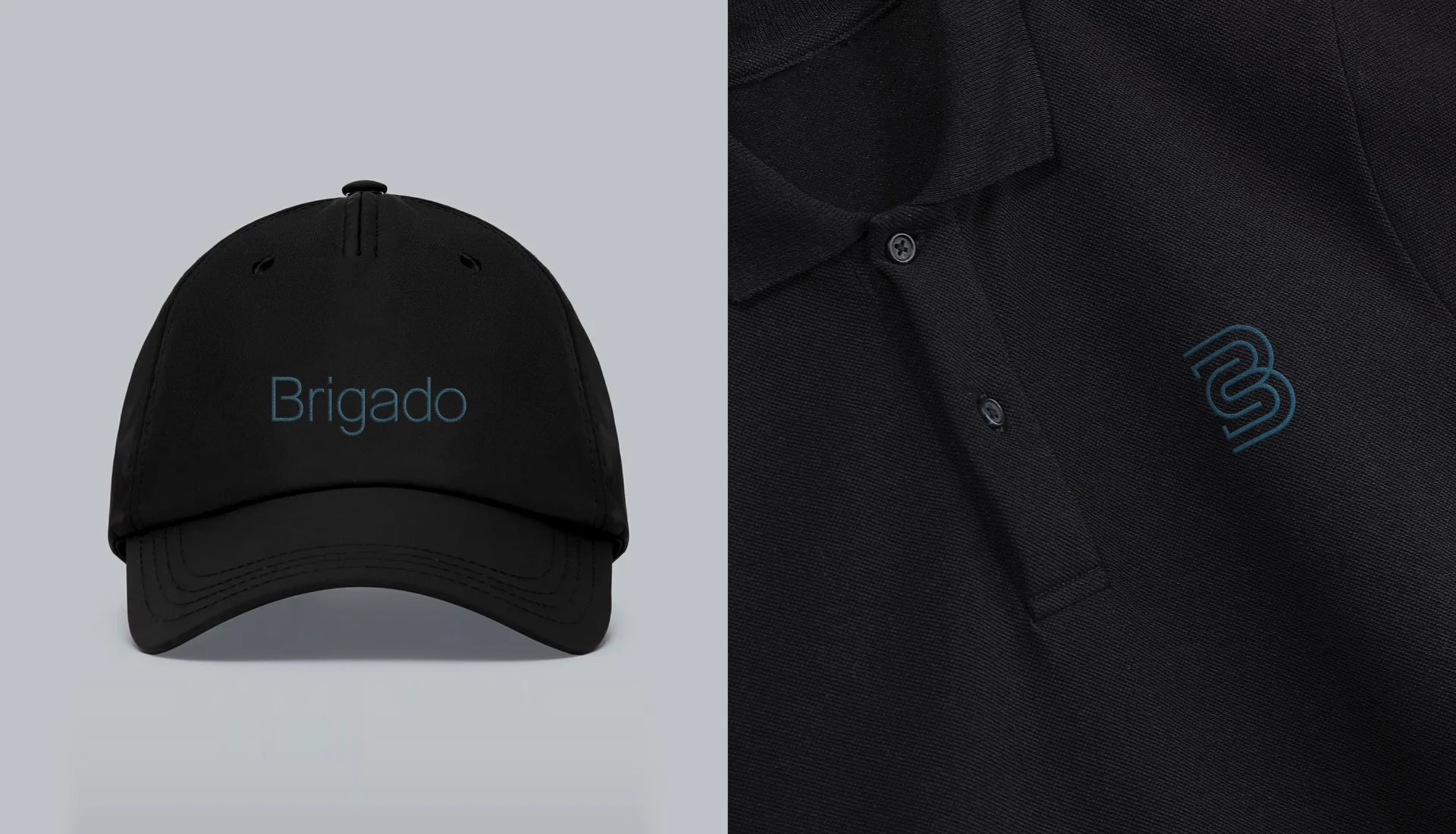
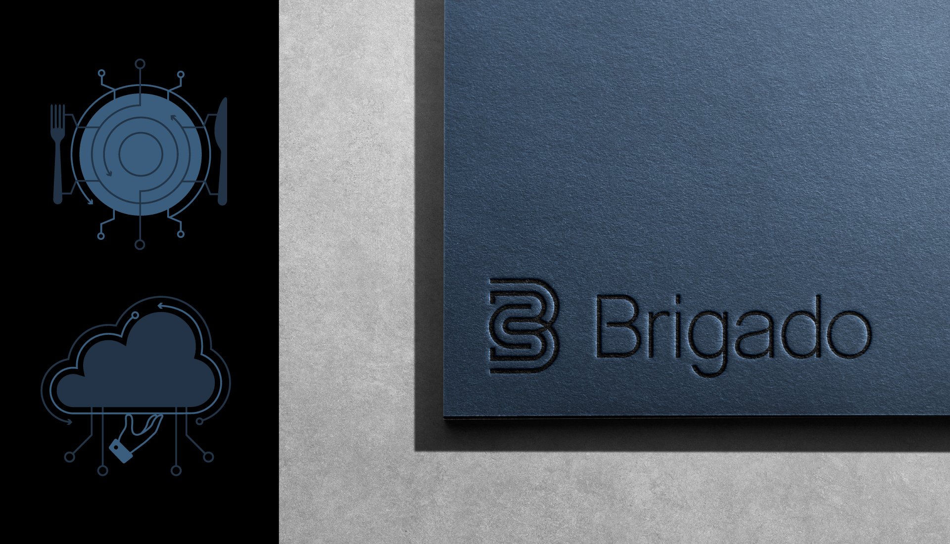
Brigado is a Seattle based hospitality consulting firm, leveraging experience, expertise, and technology for their clients. Formerly Fierro Tech, we gave them a new name inspired by the restaurant efficiency system called the “kitchen brigade” and the Portuguese word “Obrigado”. This synergy between a streamlined approach, impeccable service and welcoming nature served as the cornerstone for a brand identity that is sleek, modern, confident, yet approachable– bridging the gap between hospitality and technology.




Fire & Vine Hospitality
Brand Discovery
Brand Architecture
Brand Identity
Brand Guidelines
Website Design
Print Design
Packaging Design
Deliverables
Project Overview
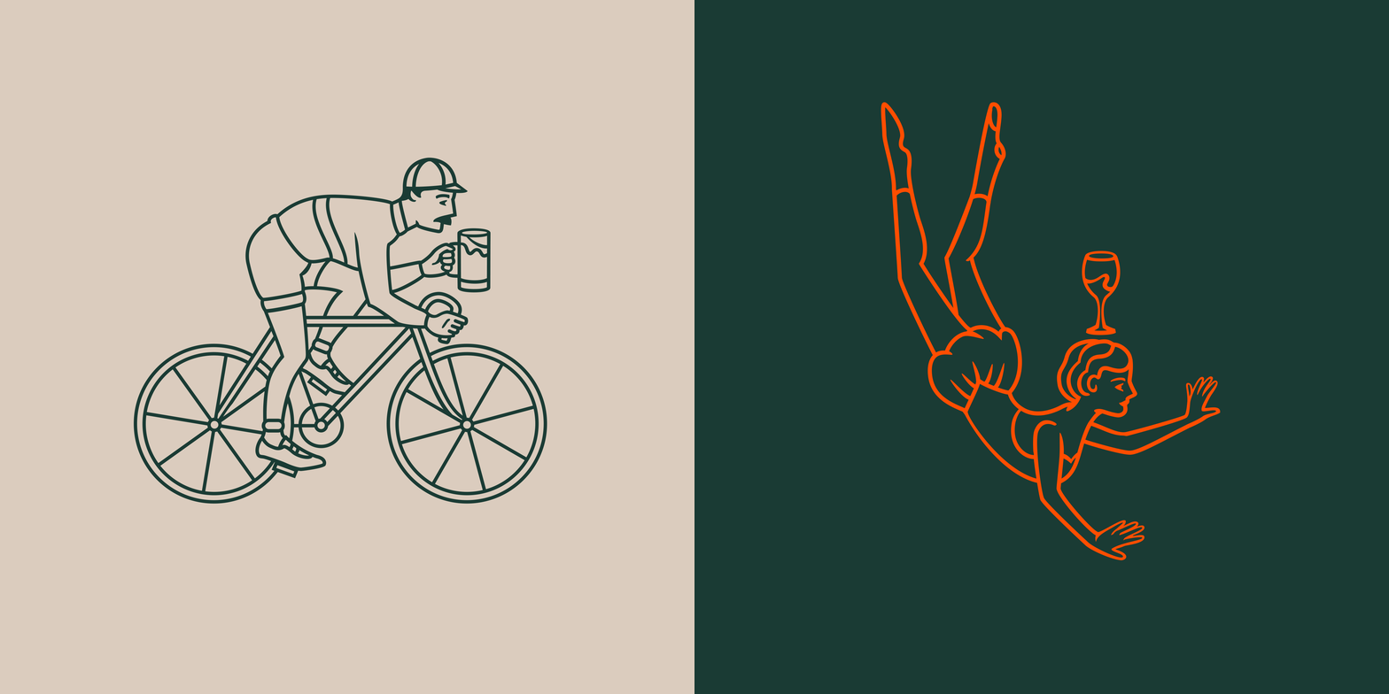
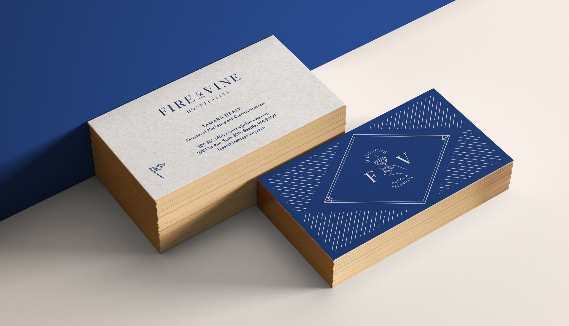
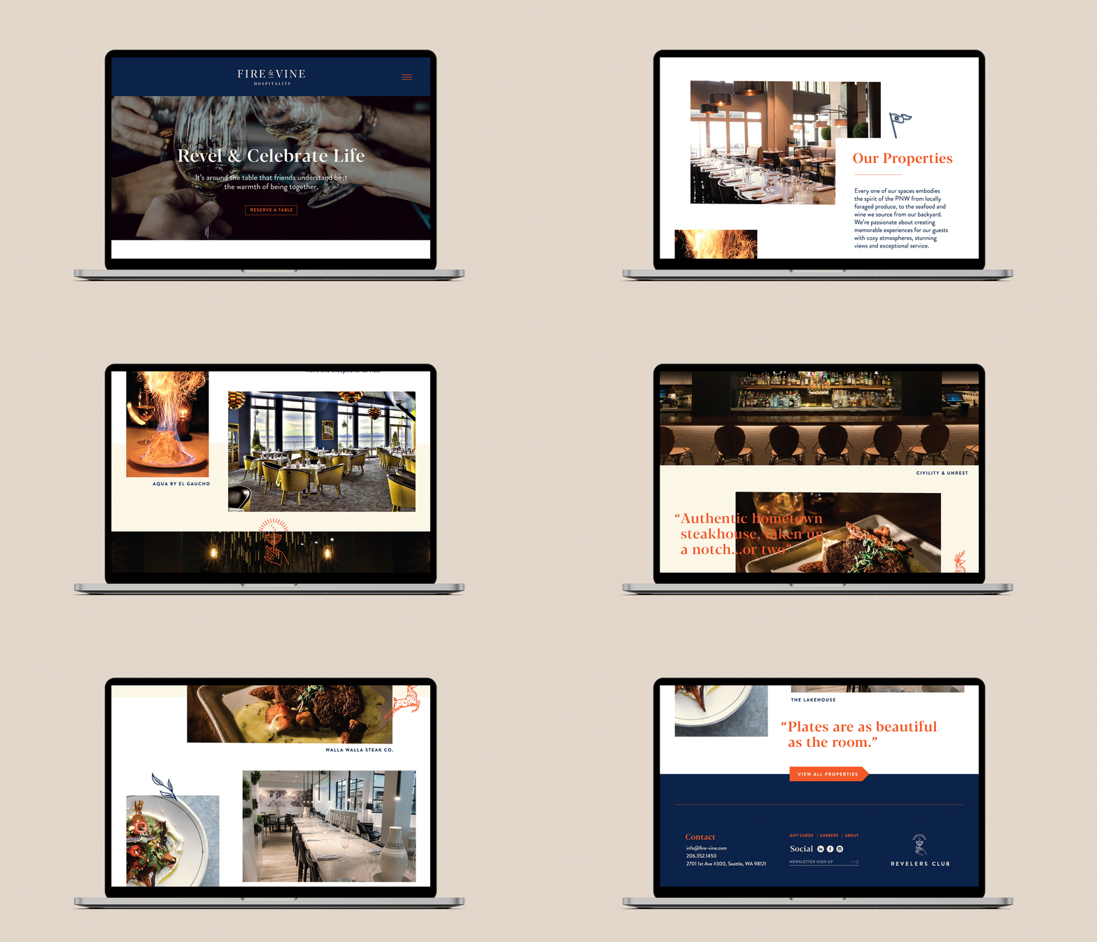
Fire & Vine Hospitality is responsible for some of Seattle’s most iconic restaurants. After decades of growth, the company needed a brand refresh that streamlined its connection to their portfolio of properties and integrated loyalty program. Taking inspiration from their brand’s “Why” which is to “Revel & Celebrate Life” we developed a brand identity with a sense of camaraderie and sophistication. It’s a celebration of their trailblazing contribution to the PNW hospitality industry that has been bringing friends and family together for over 30 years.




Greenery Salad Co.
Brand Discovery
Brand Identity
Packaging Design
Illustration
Brand Guidelines
Deliverables
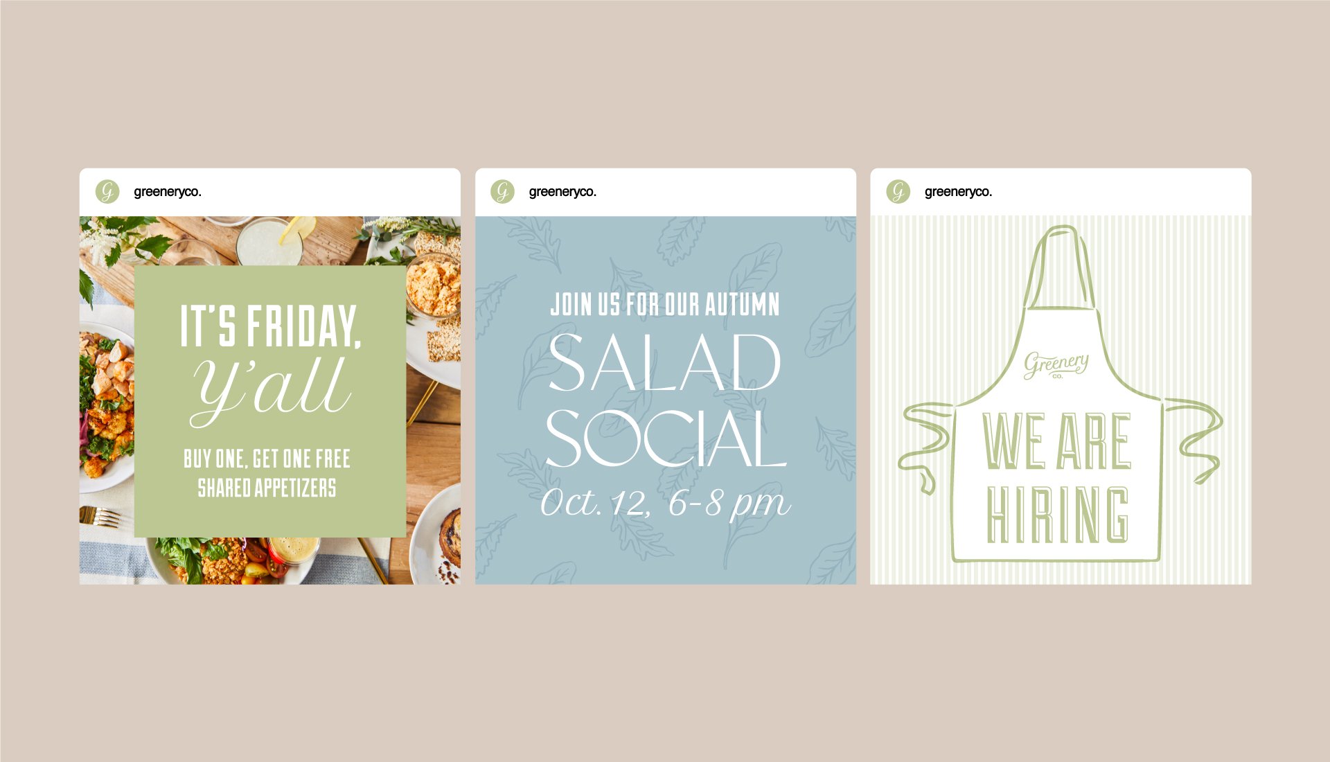
Greenery Co. was founded by two sisters who believe making thoughtful choices should be simple, especially when it comes to access to healthy and delicious food. This cheerfully iconic brand for the newly launched, Nashville based fast-casual restaurant embodies the unfailing charm of Southern hospitality. With their clear vision and exceptional taste in mind, we created a custom script Wordmark crowned by a hand drawn bouquet of baby salad greens, accented with soft pastels and simple patterning. All the visual elements layer together to create a classic, yet simple identity, that feels fresh and welcoming with a hint of artisanal soul.
Project Overview






Kelly Cannoli
Brand Discovery
Brand Identity
Packaging Design
Brand Guidelines
Website Design
Campaign Development
Illustration
Deliverables
Project Overview
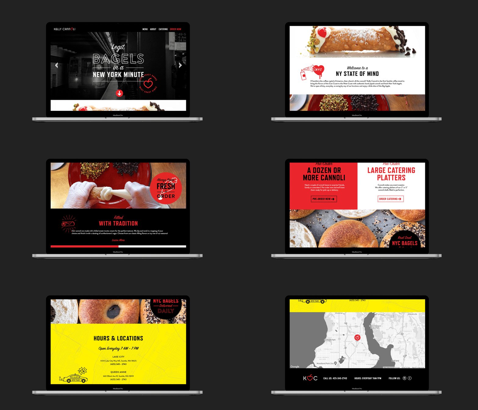
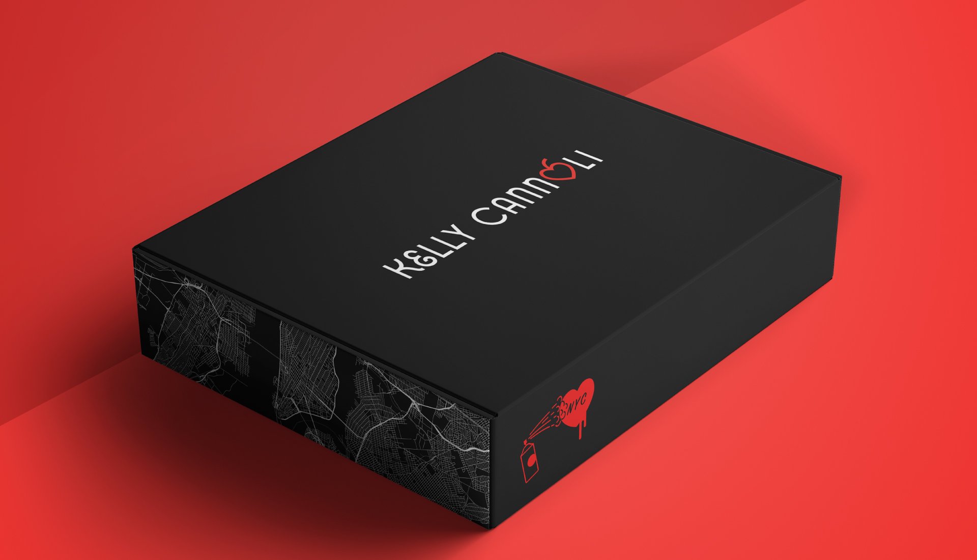
New Jersey native Kelly Wilson noticed something missing from the Seattle foodie scene – authentic cannoli. With a decade of experience in the restaurant industry and an original Sicilian recipe for the perfect cannoli, she decided to launch her business, Kelly Cannoli. Her love of this rich, ricotta-filled pastry and NYC is the heart of her business and brand identity. Catering to Big Apple transfers and those who want a true East Coast product with a playfully kitschy experience, we created a brand that felt like just that.


The Oak Room
Brand Discovery
Brand Identity
Print Collateral
Brand Guidelines
Website Design
Campaign Development
Illustration
Deliverables
Project Overview
Soon to be located in the historic Benson Hotel in Downtown Portland, The Oak Room’s speakeasy vibe is a homage to the spirit of the Oregon Buckaroos that drove cattle across the Western United States. The centerpiece Logo Mark is an oval-shaped, Portland rose icon crafted to echo the decorative leather designs of western wear. Each custom-designed brand element is inspired by flourish-tooled saddles and native patterned blankets–giving the brand a layered and refined, yet warm and rugged feel.
Misc. Work
